Feeds:
Posts
Comments

Archive for September, 2013

Color theory is all fine and good, but how can IPO photographers use color effectively in their images? We may not have control over the setting as landscape, commercial and portrait photographers do, but we can be aware of the setting we are in and take advantage of the colors that are there. We also can educate handlers and helpers about their clothing choices to create the best chance for getting the shot.

Consider the following examples:

Colors in IPO-1

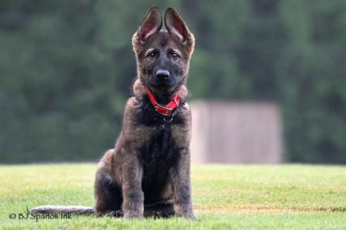
This is one of my favorite images and has been featured in recent posts. The story here is a puppy contemplating his future life. The green says calmness and serenity, but the puppy’s expression is not all that calm and serene. He’s way too serious and just a bit worried! The red collar draws the viewer’s eye up towards the puppy’s face.

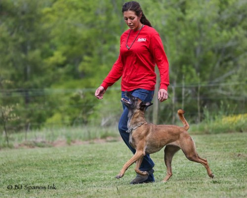
Colors in IPO-2

This is another favorite image, which like the image above features red and green, along with blue. This is a classic color combination! I would recommend this color combination to any handler. Also, notice the yellows in the background; nice highlights to what otherwise might be a boring, monochromatic background.

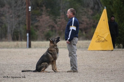
Colors in IPO-3

This image was taken in the winter, at a field devoid of much color. In taking this image, I choose to frame the dog and handler to the left of the yellow blind. The power pole also provides a frame, but I usually prefer to take power poles out as they are not very attractive. What is cool about this image is how the yellow strip on the handler’s arm picks up the yellow from the blind. His shirt also is a nice contrast to the background and his dog, as are his khaki pants. Another good color combination for handlers. Notice the handler by the blind kind of disappears into the background, thanks to dressing in black. That’s okay for this image, but might not work as well as the primary subject. More about dressing in black a bit later in this post.

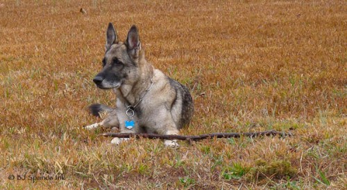
Colors in IPO-4

This is another example of a winter scene. The pasture’s grass features various shades of orange, along with a bit of green here and there. I like how the brightness of the grass allows the dog to stand out from the background. It is monochromatic, but it works, because it’s unusual to see shades of orange in a grass pasture and the color tones and shades are harmonious.

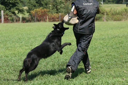
Colors in IPO-5

Back to summer. Green grass provides a wonderful contrast for black dogs! Taking this image from a position that shows the dog against the green grass and not right up against the helper, who is also in black, captures the action without muddying things up. There is also some red along the fence line, which adds a little interest and framing.

Although handlers and helpers love to wear black, it isn’t a great choice for photography as there is no contrast. Remember, black absorbs all light. As a result, a black dog and the handler’s and/or helper’s leg will likely meld together, without much definition or detail.

This is also true for white, which reflects all light. Very often, the white tends to blow out and all definition and detail is lost, not only in the white area, but also in the surround pixels. Many times, I will expose for the dog and then in post-processing separately adjust different areas of the image, such as the dog, the handler and the background. It takes more time, but it’s worth it, especially with those “money” shots.

Colors in IPO-6

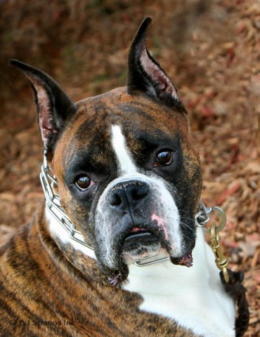
This image is a very good example of a monochromatic image. I really like the image of the dog, but the background and dog are a little too close in color. As a result, the dog tends to blend in with the background. The white along the dogs chest, neck and muzzle offers a nice contrast, however. For this image, consider placing the dog on another background or change the background color in post-processing.

Colors in IPO-7

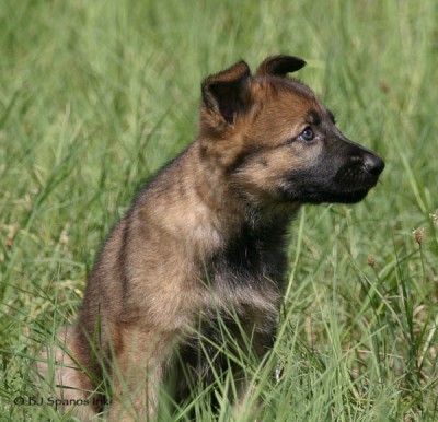
Puppies are fun to photograph as they have great expressions. The puppy stands out nicely from the green grass, but also notice the puppies hazel eyes.  Are you seeing a pattern here of how a single color can provide a focal point and/or highlight?

Colors in IPO-8

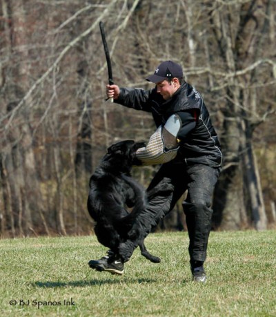
And, finally, this image illustrates what happens when a black dog and a helper in black are photographed one on top of the other. It’s hard to see the differentiation between the dog and the helper’s leg. It is good that the field and trees contrast with the helper and dog.

In closing, I encourage you to take the time to survey the field and think about how to use the available color to enhance your images. I also encourage you to explain to handlers and helpers how wearing contrasting colors to their dogs really helps you take high quality, dramatic images of their work. Helpers may not have a lot of options, as scratch pants most often come only in black, but handlers do!  It’s worth mentioning, even if they do look at you like you’re nuts.

Until next time, Happy Shooting!
Read Full Post »

If you look at the thousands of IPO photographs gracing Facebook, Pinterest, Intagram and other social media sites, they pretty much look alike, especially with respect to color. The style of photography is photo journalistic; that is, photographers capture the moment as it happened. This isn’t a surprise, given the nature of the sport and of where training and trials are held.

Although IPO fields look monochromatic on first glance, they really are not. They are plenty of colors all around. And, even if a variety of colors are lacking, such as in winter on a gray day, much can still be done with the tones and hues that are present. As noted in Part 1 of this series, color communicates an emotion or message in an instant. It also creates a mood, draws viewer attention to or away from a part(s) of the image, or adds an interesting highlight. In short, color is an important part of the story.

The following list of colors and meanings and feelings associated with them is adapted from Latrice Eiseman’s book Pantone® Guide to Communicating with Color. PANTONE® is recognized worldwide as a standard in color management among printers, artists, painters and designers. The Pantone Institute studies how color influences human thought processes, emotions and physical reactions. So, this seems like a great place to start!

RGB color wheel

RED:  Seeing this color creates a physical response with the release the hormone epinephrine, which causes people to breathe faster, raises blood pressure, and increases the heart rate and perspiration. The human mind connects RED with excitement and high energy. Red literally turns people on. Latrice writes, “It has an aggressive nature, commanding attention and demanding action.”

PINK:  “Vivid, shocking or hot pinks share the same high energy and spirit as mother red,” Latrice notes. Pink is associated with energy, youthfulness and creates “a feeling of movement and wild abandon.” Pink is fun, but it can be faddish.

ORANGE: This color is among the hottest of all colors. It brings up feelings of glowing and vitality. “In its most vivid intensities, it is perceived as a color that shouldn’t be taken too seriously; a dramatic exclamation point…It’s seen as playful, gregarious, happy and childlike…Orange contains some of the drama of red, tempered by the cheerful good humor of yellow.”

YELLOW: A color often seen on the IPO field from the sun, to blinds and the one-meter hurdle. It is “equated with splendor and heat of the sun…light and warmth.” It also is associated with imagination and enlightenment. As noted, yellow is cheerful and energetic. The human eye sees yellow before any other color. Good reason to use yellow for blinds and jumps as this color makes them stand out from the background. I’m not entirely sure the dog cares one way or the other, but for the handler and spectators, yellow pulls the eyes to these key elements on the IPO field.

BROWN: This color “is the ultimate earth color associated with hearth and home, substance and stability.” It also is associated with durability. Some view brown as dirt or dirty; not necessarily a positive response. In the IPO world, dirt and being dirty is a way of life, but for spectators or people not familiar with the sport, too much brown may be a negative. The key here is to bring out the connection with the earth – not a hard thing to do, since IPO is an outdoor sport.

BLUE: This color is a constant in our lives and “is strongly associated with sky and water…Blue is seen as reliable, trustworthily, dependable and committed. It inspires confidence.” Blue is also restful. “Humans are soothed and replenished when they view blue, and there is some evidence that when blue enters our line of vision, the brain sends out chemical signals that work as a tranquilizer.” Darker blue communicates power. Brilliant blues are dynamic and dramatic, a stark contrast, that can be used advantageously.

GREEN: This color in its many hues and tones “offers the widest array of choices.”  Blue greens are thought of as cool and clean, but also can communicate warmth. Mostly, green is associated with nature, and communicates freshness.  Deeper, richer greens are identified with money and prestige, safety and security.

PURPLE: A color with many meanings “from contemplative to regal…It is both sensual and spiritual.” Purple is not a color typically seen in the IPO world, although sunsets and sunrises are, and they can have purple shades. Consider, for example, a dog tracking early in the morning with a hint of purple in the sky or a silhouette of a dog working at sunset.

NEUTRALS: There are a lot of neutral colors, such as beiges, grays and taupe, in IPO. These colors are “seen as solid, enduring, timeless, and above all, classic.” They are safe and non-offensive.

WHITE:  Most often, IPO photographers encounter white as blown out highlights (joke!).  Seriously, this color “imparts purity and simplicity.”  It is not a color seen very often in IPO, except on handlers who wear white on hot summer days.  As it is a very difficult color to photograph, I encourage handlers to avoid wearing white.

BLACK: The most popular color in all of IPO! Many dogs are black or have a lot of black in their coats. Handlers love to wear black! Black “is associated with magical mysteries of the night.” It also communicates power, elegance, sophistication, expensive and dramatic. All good qualities of IPO dogs and handlers. Yet, it too, is difficult to photograph.

For more about these and other colors, I encourage you to look up Latrice’s book. It’s a quick, easy read. Part 3 of this series will look at IPO images and how color was used to highlight the action and to enhance the viewer’s experience. Until then, Happy Shooting!

Read Full Post »

I attended a very interesting lecture recently on color theory and color contrast in photography. It got me thinking about how to use color and color contrast in IPO photography. Yes, I know, most all IPO photographers shoot in color, so you may be asking yourself, what’s the big deal? Well, as with many elements in an image’s composition, color plays an important part in telling the image’s story as it evokes an emotional response and draws attention to or away from particular elements. Used wisely, color enhances images and the viewer’s experience.

Before considering colors in typical IPO settings and how to effectively use color in IPO photography, a quick review of color theory will be beneficial.

We perceive color from reflective, absorptive or transmitted light. In other words, the color of an object depends on how much of particular wavelengths of light are absorbed or reflected.  For example, an apple appears red, because it absorbs all of the other colors and reflects red wavelengths of light.  A black object absorbs all the wavelengths of light. Solid object reflect light, while transparent objects will transmit light through them.

This visible light spectrum correlates to a wavelength range of 400 – 700 nanometers (nm) and a color range of violet through red. The visible colors from shortest to longest wavelength are violet, blue, green, yellow, orange and red.  For more information, see the following articles:

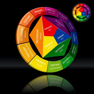
With this in mind, go back to when you first learned about color as a child. Recall, that a traditional color wheel used by artists has 12 colors, as shown below, which can be divided into three categories:

  • Primary – Red, blue and yellow, which make up all other colors.
  • Secondary – Orange, green and violet, which result from mixing primary colors.
  • Tertiary – Red-violet, red-orange, yellow-orange, yellow-green, blue-green and blue-violet, which result from mixing primary and secondary colors.

Color Wheel 1 - Shutterstock

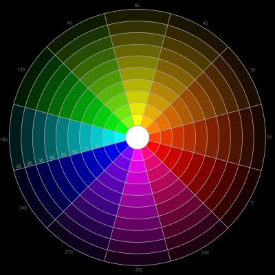
Each color is called a hue. Color Value refers to a color’s lightness or darkness.  Within each color value are tints and shades. Tints refer to a color where white is added to lighten it, such as pink (red + white), and shades refer to a color where black is added to darken it, such as brown (orange + black).  See the color wheel below.

Traditional Artists Color Wheel 2

Color directly across from each other on the color wheel are called complementary colors; for example, red and green, blue and orange, and yellow and violet. These colors can compliment each other or contrast with each other. There is no hard and fast rule about whether or not a particular color combination is pleasing.

But wait! There’s a twist when it comes to photography! Artists mix pigment, but photographers mix light, and light uses a set of different primary colors. As explained in the Franklin Institute’s helpful article:

“The primary colors of light are red, blue and green, and the secondary are yellow, cyan and magenta … Red and green paint, for example, make brown paint, but red and green light makes yellow light … When beams of light are mixed without any absorption, an additive process occurs. The more we mix the beams, the closer they get to white light.”

These primary colors form the basis of the “Additive Color (RGB) Model, named because black is the base and light is ‘added’ to eventually get to white, which is all of the colors together. Additive colors are seen in televisions, nature and computer screens.” Our retinas also are sensitive to these same primary colors. “Just as any color of the [light] spectrum can be made by mixing the three primary colors, so do our own eyes discern the various colors by sensing different wavelengths with these three receptors.”

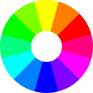
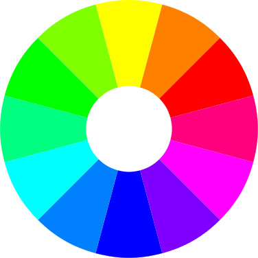
With this in mind, a photographer’s RGB color wheel might look like this:

RGB color wheel

One more bit of theory before moving on. “Saturation is how intense colors appear. Over saturation of color can result in loss of detail or clipping. Vibrance is a smart-tool used in photo editing software that increases the intensity of the more muted colors and leaves the already well-saturated colors as they are.” For more about the hue, color value, saturation and vibrance, see the following articles:

Without getting too much into the weeds of color management for image files (a topic for another day) and color theory, what’s key here is red, blue and green light are not only the primary colors in nature (the outdoors being the most frequent location of IPO photography), but they also are the primary colors we use to see and to create color in televisions and computer monitors, the most frequent viewing medium for IPO photographs. So, it makes sense to think of color in photography for the purposes of image composition in this context.

Part 2 of this series will discuss what colors may symbolize and how we perceive them on an emotional level. Part 3 will wrap up this series with examples and tips on how to effectively use color in IPO photography.  As always, thanks for visiting and Happy Shooting!

Read Full Post »